Chromachron Colour Time
£375
Chromachron Colour Time – The “Anti-Stress” Watch.
This is how the Chromachron Colour Time was described when it was introduced by its designer Tian Harlan in the early 1970’s. It took away the stress of being “on-time”; by replacing each hour for a coloured “pie shaped” segment. This means a Chromachron never displays the exact time. Instead, you have a “feeling” for the time of day, which is much more relaxing.
“Colours of Time” was the foundation of Tian Harlan’s concept. Taking the subtle change of light over the course of a day, in terms of radiance and energy, was his inspiration. The dial would be printed in twelve segments, each representing an hour of daytime.
The colours themselves were not chosen at random. 12 o’clock is bright Yellow, for mid-day is when the sun is highest and brightest. As the afternoon progresses, the colours get increasingly darker as the sun fades away. By 6 o’clock the colour has changed to Blue, in honour of dusk. It also applies to the mornings too, with each hour a brighter colour than the last, as the sun rises.
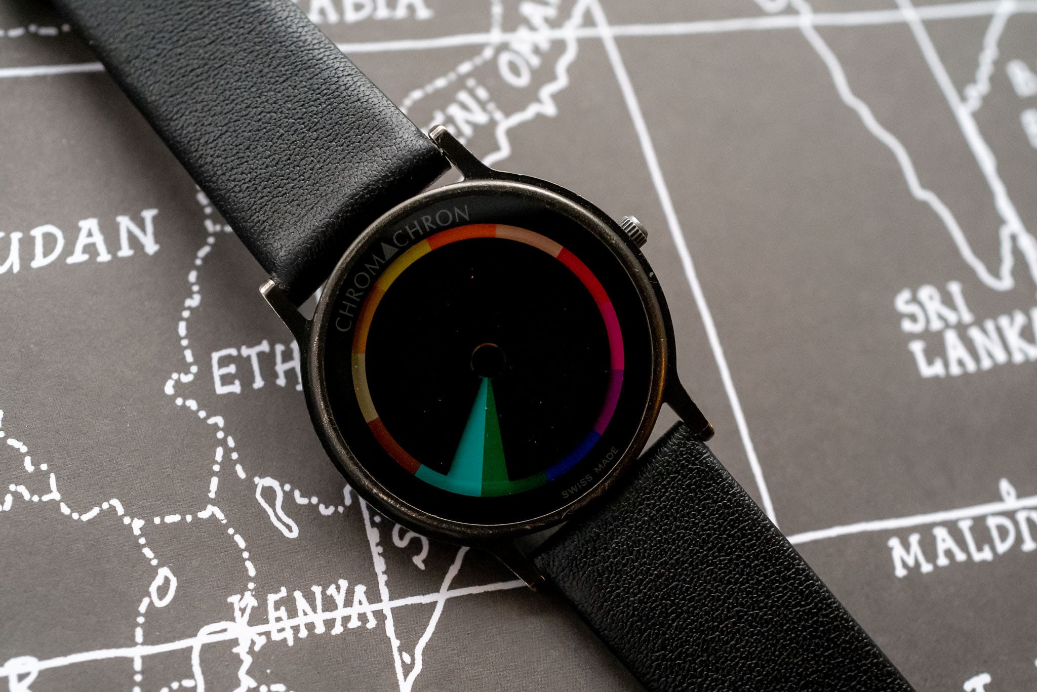
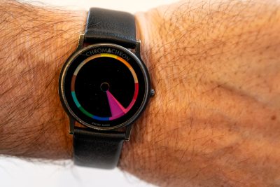
A Chromachron doesn’t have conventional hands; instead it divests itself of the minute hand altogether, and the hour hand is replaced with a Black disc which rotates one coloured segment every hour. This disc has a pie segment cut out which represents One hour. This way of reading the time, takes some “time” to get used to, but it brings a more zen like feeling to its passing. As minutes fade away, it teaches you to imagine your schedule in a more tranquil way.
Our particular Chromachron is lovingly used. The black PVD case, crystal, face and case back have minor wear-marks, which create “bright-spots”, but nothing that detracts; think of your most comfortable pair of shoes or your favourite jumper. We are including a new (non-original) strap with the watch too
Its thin profile makes it a delight to wear; and having a quartz movement it is keeping perfect time, although in a very casual way.
In 1976, Chromachron watches used a clever marketing tactic aimed at the U.S. market. It connected the contrarian nature of pairing an imprecise watch with the fastest mode of transportation around. “The Most Relaxed Watch on the Fastest Plane to America,” was the tagline, and it marked the occasion of the first commercial flight of Concorde.
Concorde has faded away with time, but the Chromachron still survives. Perhaps, its more relaxed attitude towards time as a construct, is the reason why!
Wearing a Chromachron gives you the very best excuse when showing up late too…. “I am so sorry, I know we were supposed to meet in Orange, but I just missed it and drifted into Pink” is a sure way to be remembered; and maybe even to be forgiven for being late in the first place.
We shall leave the final word to Tian Harlan… When asked about the Chromachron, its inventor simply replied: “I have designed my watch for people, not for machines, or people who function like machines.”
Wear a Chromachron…. And Relaxxxx!


